Sunday 28 November 2010

Defacing Money Project


From the research I did for examples of defaced money, I defiantly knew that I wanted to make an object or sculpture out of the money , as opposed to simply defacing the note itself by drawing or painting on it. Also like in the the example of the fish I knew I wanted to include coins along with the notes I printed out.


I chose to construct a bag and shoe made from english notes and coins. The idea was to comment on the issues of consumerism and designer goods. When buying a designer handbag, the handbag itself costs nothing to make but what you are essentially paying for is the name and brand, to prove your wealth. This bag and shoe reflects that idea, it literally says 'look how much money I have as I have enough of it the wear on my feet'. I am particularly pleased with the shoe. It was a chalenge to construct and I really like the used of the coins joined together to form the heal.

Visually Represent a Word Project

Foot The Bill

Drag Your Feet

Cold Feet

Foot Fetish

Best Foot First


For this short project I chose to visually represent the word 'foot'. I focused on the idioms surrounding the word, and because there are a a lot I found it easy to think of visual puns for them. I really enjoyed this project and found I was good at it. I think this type of thing suits my type of humour and personality. As where I found the visual representation of music difficult because it was abstract, i found this project enjoyable and inspiring, as I took a more literal approach.

Visually Represent a Piece of Music Project


This was a project to visually represent a piece of music. I chose the piece above entitled by 'The Last Emperor'. The brief asked for an abstract painting, to promote an immediate reaction to the music in banner form. I misunderstood and did not paint abstract however this was my immediate response to the music. I thought of blossom trees, red lanterns pinks blues and greens, wind, chimes, meditation, mountains and lakes. Although I did not automatically consider the composition,it flowed natural as I was going it and I was pleased with the overall outcome. It depicts my immediate response to the music and what I felt at the time. I am currently working on more banners that are more abstract and based on the music to fulfil the brief.
This was my second attempt at painting an abstract representation of the music. When listening i saw images of tree branches, mountains, blues, pinks, purples and greens. I painted the jagged lines as a representation of theses branches and the mountains. I like the painting and the fact that its a triptych, however it feels too planned and not a immediate response to the music. From this I did three more painting simplifying what I immediately saw evoked from the music. These were done loosely and were quick and flow better when associated the music.


Tuesday 16 November 2010

Manhattanville Exchange Project


This is the final outcome from the research of the illustrated dictionaries. As the brief of the exchanged changed from A5 to postcard size with a limit of 10 images, I had to re-adjust the project slightly. Still keeping a similar format to that of the dictionary 'The A-Z of Fashion' (see earlier post), I used the postcards as for a basis of a kind of flash card for translation purposes. The English word appears above the image and a definition with the American equivalent word. The text and content is taken from a dictionary to give a more authentic feel. I did originally have the imaged scanned in and printed to postcard standard, however the original images looked more interesting, so using the hand painted images I printed the text around them. This gives the images a more tactile and personal feel.

Tuesday 9 November 2010

Some more of the 1000 drawings


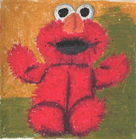
Im so pleased with the way my observational drawings have progressed over this project. I chose to draw predominantly from the Museum of Childhood. After feed back of my previous drawings I drew toys that had more texture. I added colour, tone and shadow to do this, and I believe that they were more successful. I was particularly impressed with my oil pastel drawings. I haven't picked up an oil pastel since A-level and I found it easier than I thought to get into the process of using them. It was like riding a bike, I hadn't forgot how to use them, and my initial skepticism of picking them up was without cause. I think my favourite medium is colour pencil with pen and this is my safe place of drawing. Through this process i have discovered that even though my safe place of drawing is successful, pushing myself to use other mediums ie pen and oils have shown me to not be so tentative and negative about trying new thing. If drawings are unsuccessful, move on and learn from it and dont concentrate on the negative. I think this was undoubtably a good exercise to start the year, i feel more confident in my drawing ability after a long summer of being complacent.

Monday 8 November 2010

Altered Book Project Research


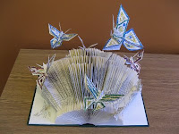
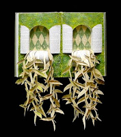
Really looking forward to starting this project. Have so many ideas its going to be hard to choose. I've found my book already that im going to alter. Its called 'British Myths and Legends' by the Folio Society. Its a hard casing containing three hard back books called 'Marvels and Magic', 'History and Romance' and 'Heroes and Saints'. Initially i was drawn to the book in the charity shop because of its old antique look and the titles of the three individual books. Now looking at images above, I am exceedingly happy to have bought three books in one, as i would like to try all the techniques shown above. Im thinking of maybe a triptych of altered books, one being painted into, one to have cut pieces protruding out of it, and another to be made into almost a sculpture, all embodying the context of myths and legends of the books. As the project goes on and the process begins, hopefully each book will manifest to combine all three techniques and the triptych will look more cohesive and impressive.