Tuesday 21 June 2011

Free Range Exhibition - Old Truman Gallery in Brick Lane


I've had some good feedback and reviews from the exhibition, mainly for my anatomical prints. Below

are websites that I've been featured on.

Saturday 21 May 2011

Illustration Final Project - Modern Runes

My Personal project was to create a new astrology by creating a modern set of casting runes. My work is usually dominate by science. I am fully believer a science as fact, so I wanted to create a satirical set of runes. After buying a set of traditional runes I found that they were completely out of date with meaning of the stones like harvest etc. So I decided to create a set of runes that reflect modern culture and language. So on my stones I decided to illustrate thing such as: The Dogs Bollocks, Shit hitting the fan, Gets on my tits, Pork pies, and at it like rabbits. The illustration of words and puns and idioms suits my personality and humour. I had a lot of fun think up what to put on the runes. The set contains 24 runes carved out of wood, a casting bag and a hand stitched booklet containing the meanings of the runes and an explanation on how to read your fortune. Underneath shows my progression and the final result.


I am very pleased with the outcome. I'm very pleased with how the set ties nicely together. I think it looks very marketable. I hope everyone has as much fun playing with them as I do. My fingers are sight to behold after al that carving. OUCH!


Sunday 15 May 2011

Printmaking - Final Pieces


These are the final pieces that I will submit to the final degree show. I am very pleased with the outcome. My intension was to create a way to make deadly viruses and diseases appealing, tactile and beautiful. I like the technique of white ink on white paper, gives the feeling of the pieces that idea of a petri dish, (the idea of silent killers, barely visible but there and waiting. The colour is also very 'hospital-ly'. The Diamond dust used also ties the whole thing together too, in that the whole thing looks like a chemistry experiment. The dust looks like a reactions and the crystals are the product.
I thing the whole thing is so much more than 'pretty', but has meaning on many different levels.

Cyanotypes - Printmaking


I think that these pieces, (although starting off as just an experiment) are very successful. I had never done Cyantypes before and was interested in learning the technique. The colour and the way the chemicals have been applied gives the pieces a fluid quality. This adds to the organic nature of the content. I LOVE CYANOTYPES!

Monday 2 May 2011

Printmaking Personal Project Research


I know what your thinking.... adding glitter to prints... this isn't primary school. However this is not glitter this is DIAMOND DUST!! ... well crushed glass.. but it has been used by some very noted artists. To take my prints of viruses to the next stage, they need to become appealing to the eye. This firstly is eye catching but also it adds to my concept of trying make deadly strains of deseases tactile and beautiful. From what I can tell this stuff has been used in a very kitch way, mostly along the lines of sickly sweet pop art themes. My use of it is not cliche but to add irony and depth of meaning.


Andy Warhol


Ron English

Peter Blake

Mark Webber

Damien Hirst


Russel Young

Cycling In London Project


This brief was to create a poster for tfl to promote cyclin
g in London. It could either promote cycling as either a fun or quicker or healthier way to travel. I first thought of the concept of emissions. Where a car produces smoke, I thought of the idea of the emissions on the bike being and displaying London landmarks. This also having the double meaning, in that having many different land marks in one stream, shows cycling also as a quicker way to travel.
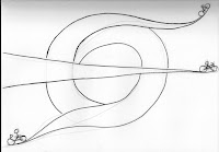
I then used this idea of emmisions to try and manipulate the london underground logo.
I however after having this thought got too absorbed in it and rendered my poster to look more like the existing logo but make it look like a round-about. I was a bit to obvious and boring.

I then started to think of the bikes themselves in the poster. Because after al it is a cycling brief. I wanted to include business men in suits and fashionable young women in the poster to promote it to the people you are least likely to se on a bike in London.


I then moved back to my original sketch but adding a third person as it filled the page more nicely and the overall composition displays most successfully my concepts and is the most visually appealing.
I added a mountain biker as my third person. Just to display the adventure and fun biking can bring. He works well as the stream starts in the top corner of the page and makes it look as if hes cycling up hill, adding to the mountain biking theme, as we know some parts of London are very hilly.

The top left and bottom right corners were looking too bare. I decided to include as if the streams were coming off the page like the centre one. It still keeps the london underground logo shape but also has the extra benefit of being less obvious. Perfect balance of subtly and obviousness.


I love the overal result. I chose to keep the colours quite muted. The drawing itself is busy enough I didn't want to over do it. Originally I had the roads as all one flat colour, but after feed back to differentiate between them, I decides to make the roads different tones. It works better as it gives more depth. I'm chuffed.