

I want to carry on the ideas that I started last year. Carrying on from my fascination of science and all things that are medical and disgusting. I looked at the work of Helen Chadwick and Christine Borland. I was particularly interested in the work Helen Chadwick. Observing through a microscope she drew the stages of developing embryos.
From his I got inspired by the idea of cells. Having never done colograph before, I got inspired to do it as part of this project. The sketches below show the composition of the pieces and one is the original colograph plate that I plan to press tomorrow.


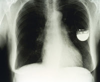
From this I have worked out how to progress. I researched into the artists of the welcome collection. The Images below are taken from the collection. I looked into the idea of aliments and illnesses. This is what i would like to represent in my final year project. I want to make things that usually repulse us, appealing and almost beautiful. The following three images are of illnesses (in order) Osteoporosis, X-ray of a pacemaker and a close up of a blot clot. They will be useful as ideas that I may transfer to etchings.


Whilst searching I came across a lot of sinister old illustrations. These maybe a path to consider when making illnesses look appealing. On the surface these illustrations look comical. But after examination they are quite disturbing. The first portrays a name 'drinking himself to death'. The second when translated, The text warns that 1 in 8 children die before they are one years old, and that by caring for their children, mothers will cheat the hands of death. The third shows a Cruikshank print. He had been in his youth a heavy drinker, as his father had been, but after completing 'The bottle' he took the oath of abstinence from alcohol. In this print, the drunkard's daughter commits suicide by throwing herself into the Thames. This is one idea in make the illnesses look appealing. Adding a cartoon effect will initially draw people in.


Below show more examples of illnesses. The first image shows a human lung infected with influenza. The second shows the influenza viruses infecting cells of the trachea. Although these certain images do not look appealing, this is the kind of thing that I am after. They almost look pattern like. I like the antique look of the first image, however I want to try and move away from*Ooooo something old looking I must use it* as this was used vastly last year.


This is the concept that I particularly like the most and want my work to eventually look like. The image below shows a diagram of insulin. Dorothy Hodgkin's diagrams of atomic structure were used as inspiration for wallpaper, curtains, laminates, carpets, dress fabrics, ties and crockery. I love that that even though it a medical illustration, it is so inviting and beautiful. I wist to apply this aesthetic the concept of illnesses and diseases. I think this type of composition may lend itself successfully as visually represented as a colograph. Repeating the image multiple times on one page maybe something to consider also.


No comments:
Post a Comment